Hi!
I want to create a visits total by month over time plot - i found these instructions but i’m not sure how to find that config setting. i am using matomo cloud.
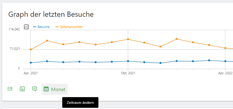
my plot looks like this - but i’d like it to be summarized monthly rather than daily.
many thanks for any guidance
Hi!
If you hover over your plot there should be some green icons for options down on the left.
Here you can change your daily plot to a monthly plot. Hope that works for you.
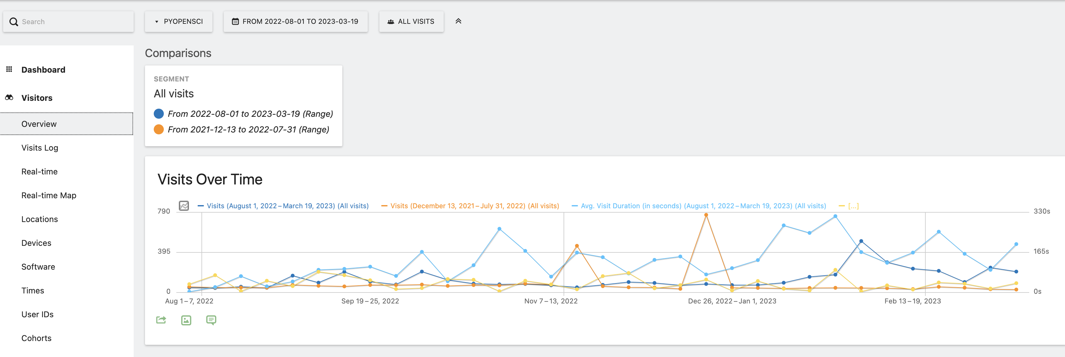
Hi there @Florian_Rebmann many thanks for this response. i don’t seem to have the 4th green icon that you have. here is another screenshot where i tried to create a plot comparing two time periods but it’s weekly . i don’t see the 4th option when i hover over to change it to be a monthly plot but i do see the first three.
i also tried to create a custom report to no avail.
i’m curious - did you try to do this with a custom time period? that is what i’m trying to do so i can compare 2 years? it seems like it won’t allow me to specify time period to aggregate (month vs day) when i use a custom date range. And it also sometimes provides data back to 2013 when i don’t have any data . the behavior is a bit different from what i expected but it could still be user error.
You’re right, if I do this with a custom time period the plot automatically shows the data per day. Unfortunately I don’t have a solution for this, although your use case seems definitely like one that should occur more often.
@heurteph-ei Can you somehow unmark my answer as a solution? Since there isn’t a possibilty to show your plot with a custom time period my solution doesn’t really fit to the intended question and I didn’t find a possibilty to do ist myself. Thank you!
1 Like
Hi @leah_wasser
The configuration you found in the FAQ you provided is not available on Cloud:
If you’re using Self-hosted Matomo, by default unique visitors metric KPI is processed for days, weeks and months. If you’re using the Matomo Cloud service, unique visitors metric KPI is processed for days and weeks only.
Data archiving (especially for unique visitors) for large periods is time / CPU consuming, then year and custom range is not available for unique visitors.