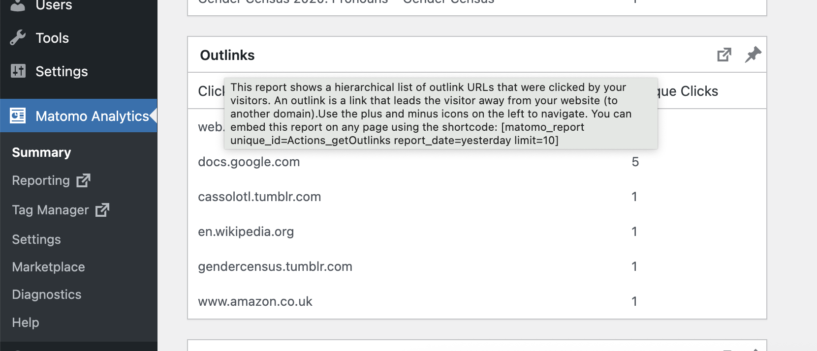
This one says, “Use the plus and minus icons on the left to navigate.” But there are no plus and minus icons on the left, or anywhere else that I can see.
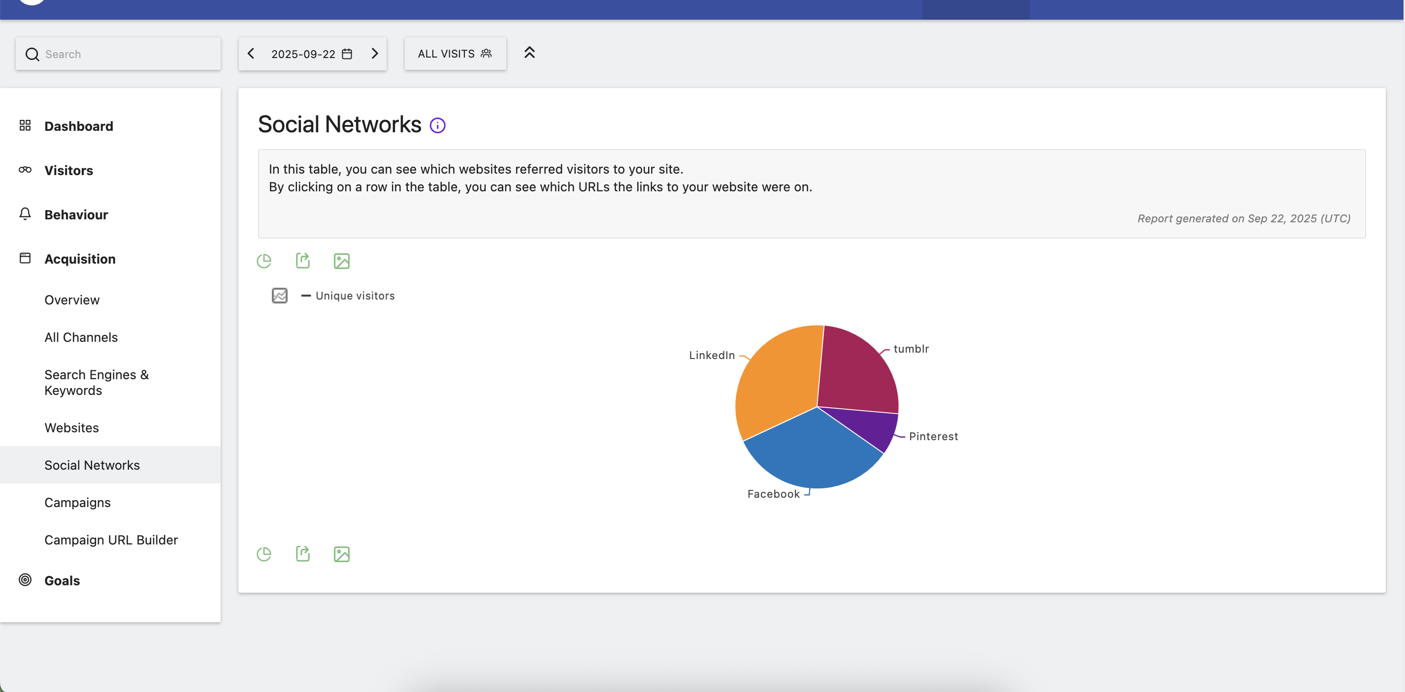
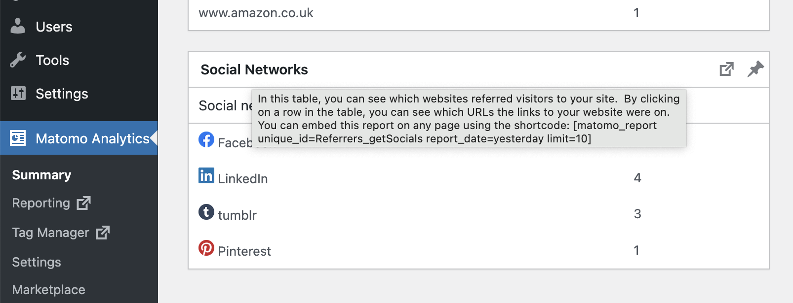
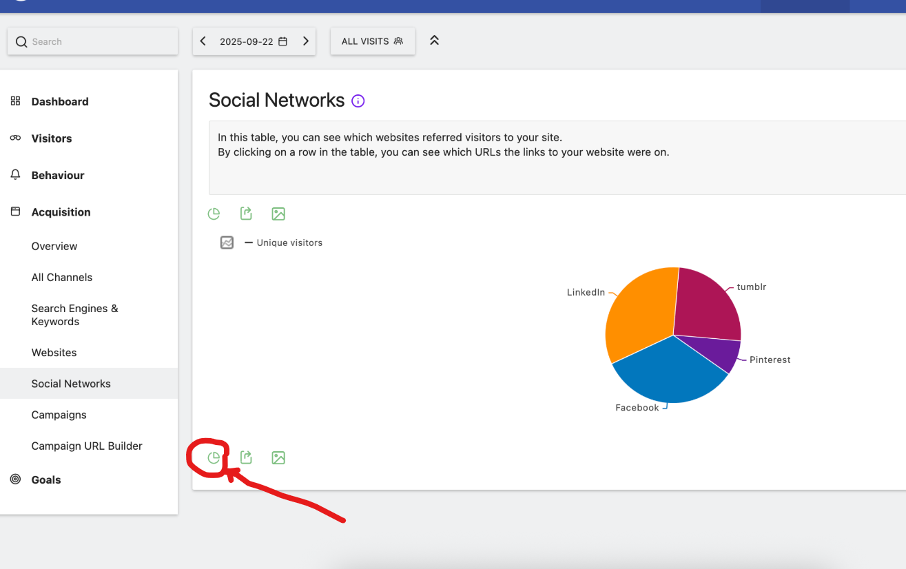
This one says “By clicking a row on the table, you can see which URLs the links to your website were on.” But when I click a row in the table, nothing happens. (I’m sad about this, I would love to see specific URLs!)
@Emerson_N, do you mean that the plus and minus buttons are like “next page/last page” instead of expanding to show specific URLs?
It says that someone outlink-clicked on cassolotl. tumblr. com but not which specific cassolotl. tumblr. com URL. I feel like that should be visible even if there are less than 10 reports in the table. So I assume I have misunderstood something about the help text?
(This forum is forcing my URLs to be links, and then telling me that I am not allowed to post links, but not letting me un-link them - so I have to break the links by adding spaces.)
I don’t think you’re doing anything wrong. That honestly sounds like outdated or context-mismatched help text rather than user error, especially if the UI element it references simply isn’t there anymore.
I’ve noticed analytics dashboards sometimes keep legacy tooltip text even after table layouts or interaction flows change in newer versions. Makes things surprisingly confusing because users start looking for controls that no longer exist.
Little UX inconsistencies like this seem minor, but they can really affect how understandable reporting and tracking tools feel overall.