Hi,
The % Change over the period graph never seems to be relevant. What this is comparing is the value at the first data point and the value of the last data point. This is almost never a relevant measure when looking at a date range. The first and last points can be comparing a Monday to a Sunday for example.
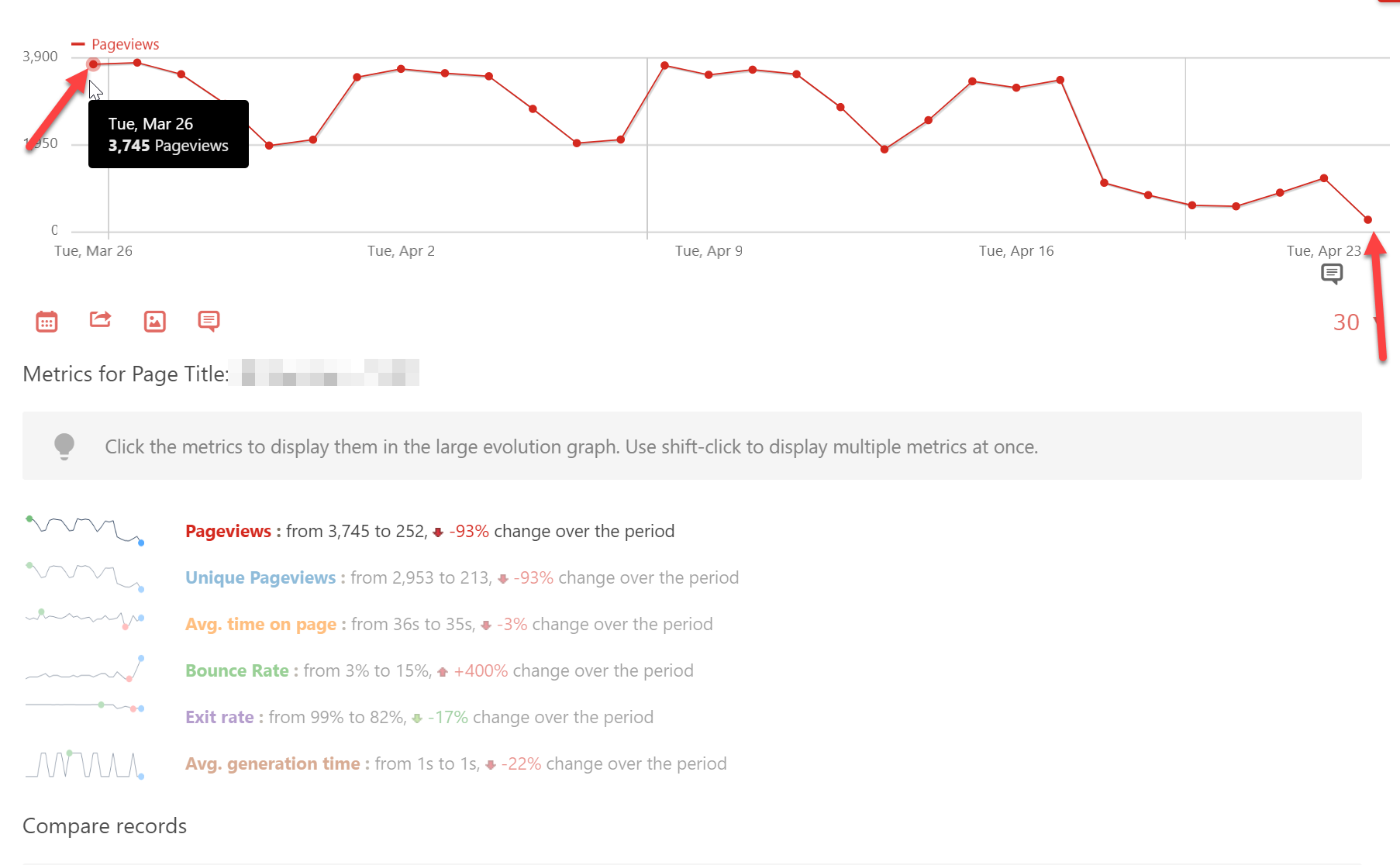
It would be more informative to add a trendline and show average decrease over time IMHO. Let me know if I’m missing some other utility of this figure. Thanks!