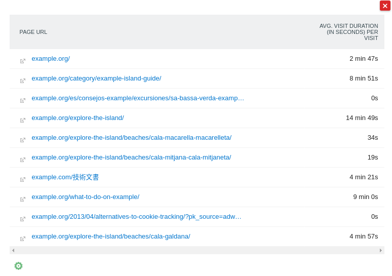
Currently, within the custom reports, we are only able to select metrics that display the time duration in seconds. For example, Average Visit Duration (in seconds) per Visit or Max Visit Duration (in seconds). When you are displaying that type of information on a chart or table and have visitors that typically stay longer than 2 minutes, the data starts to become invaluable. The last thing I want is for an executive to be thinking about how long 1578 seconds is when looking at a chart in a presentation or email report. The goal is for this data to be quickly and easily consumed.
We would still want to make sure seconds are included in the minute’s display because it could be impactful to understand a visit being 2:00 exactly or 2:59. So the format would ideally be mm:ss. From our experience, we do not have any users that would characteristically be visiting into the hour’s time frame.
A few possible solutions could be the following:
- Allow the admin to designate whether time in charts and graphs are displayed in seconds or minutes.
- Create separate metric options for custom reports that allow you to select whether to show seconds or minutes like Max Visit Duration (in seconds) or Max Visit Duration (in minutes).
- Allow the user to decide when viewing the custom report whether to convert the seconds into minutes.
I am more than happy to help elaborate on the use case and the possible implementations! Thanks in advance.